Ecosia
Earlier in the year I collaborated with Koto on the rebranding of search engine Ecosia.
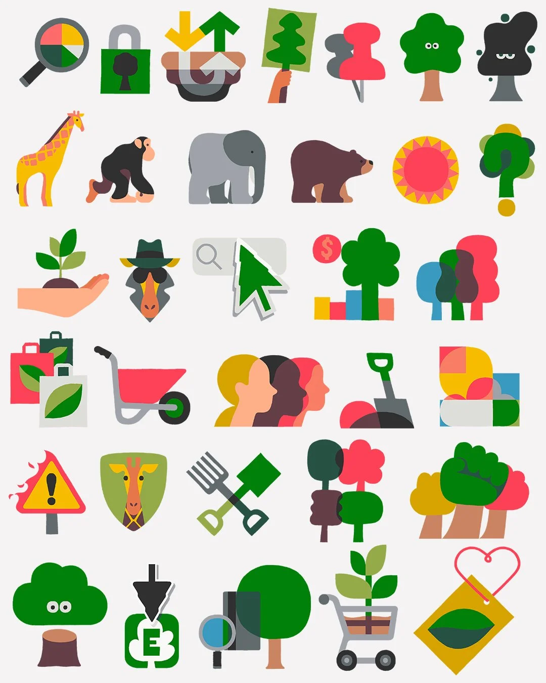
Using the initial stages of Koto’s rebrand as a starting point, I developed a series of icons that illustrate 'complex ideas in wonderfully clever ways' (Koto's words, not mine!). My drawings were then turned into vector form (I still draw everything by hand and can't use vectors) and subsequently sensitively brought to life with subtle animation.
The icons had to communicate the concepts with minimum means as many would be barely a few pixels in size. Not only that, but they would also have to read clearly in ‘Light’ and ‘Dark Mode’ on various devices. In order to make this transition seamless I developed and expanded a colour palette using Ecosia’s core brand colours as reference.
The project was absolutely joyous. There was a wonderful synergy between Koto, Ecosia, and myself. It was almost unerringly 'pain-free' and it’s projects like these that have restored my faith in taking on commercial work.
You can read more about the Ecosia project over at It’s Nice That.